


“Daddy, why is Mario orange when he has fire?”
That was a question my then five-year-old son asked as we were eating breakfast together one day. The answer, which I’ve known for 30 years, was something I never gave much thought. “It’s so that when you look at him you remember whether or not you are Fire Mario.” That’s when it dawned on me: Fire Mario was one of my first and most prominent exposures to User Interface design.
Over the years, Nintendo has done a fantastic job using User Interface (UI) elements to convey information to Mario players of all ages. They’ve used sound and visuals to indicate the various powers of our favorite plumber, so whether Mario is blinking, wearing a frog suit, or has raccoon ears and tail, it’s apparent to the player that he has specific abilities.
Although Super Mario Bros. can still be challenging for adults, (I can’t stand those Hammer Bros. in level 8-3.) the game makers needed to make the game easy enough for a child to enjoy. This is a big reason for why the UI examples are not limited to Mario’s powers.
Through great UI and cohesive User Experience design, the basics of the game are immediately obvious. Level 1-1 even acts as a built-in tutorial. Think about what you learn within the first few minutes of playing the game:

-
- Jump on your enemy to defeat it
- The question mark blocks contain power-ups
-
- Mushroom = Super Mario – You don’t lose a life when you get hit
- Fireflower = Fire Mario – Throw fireballs at your enemies
- Starman = Invincibility – Defeat enemies just by touching them
-
- You can break bricks as Super Mario
- You should collect as many coins as possible
- When you stomp on a turtle, their shell can be used as a weapon, but can harm you
- When the music speeds up, you’re running out of time
- If you’re really good, you can find:
-
- Hidden items such as 1-up mushrooms
- Secret passages down pipes that lead you to more items
-
Like the levels in Super Mario Bros., your website or app should use visual cues to point out where interactions are possible. The most basic demonstration of this includes consistent hover states for all links so the user knows where they can click.
Of course, hover states in mobile are irrelevant, but you can still set your links apart by using underlined text or giving them a button-like appearance. Just like those blinking question mark blocks, it should be obvious to a user where they can click or tap in order to interact.

There are many additional UI elements in Super Mario Bros., but those basic concepts in Level 1-1 teach you the skills necessary to handle challenges that come later in the game. Video game UI and User Experience (UX) have greatly evolved over the years, but you can still find concepts that were inspired by the 8-bit classics. Here are some other examples of UI design in classic games:
-
- Punch-Out!! – Each opponent has a certain movement before they attack
- The Legend of Zelda – Your level of health is indicated by heart symbols
- Pac-Man – When ghosts are blue, you can attack them
- R.B.I. Baseball – When a pitcher gets tired, the ball slows down and becomes difficult to control
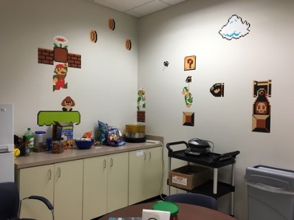
These are just a few of the endless examples of how classic video games utilize UX and UI design. But enthusiasm for these classics runs deeps at Celerity. Our Agile Development Center in Mechanicsburg, PA is frequently fueled by 8-bit inspiration. Our team’s conference room showcases sprints named after classic video games, and our kitchen features a Super Mario Bros.-inspired scene:


But if that’s not enough, you can always find a Moleskine notebook in my designer’s toolkit, where I sometimes get distracted by 8-bit daydreams. Here’s my Mario pencil sketch – Squared notebooks are great for pixel art sketches!
Now that you know you’re in the company of video-gaming friends, tell us: What are some of your earliest memories of UX/UI?